Unless otherwise noted - Photos, Text by Mike Strong. All code is original by Mike Strong. Copyright © Mike Strong All rights reserved
| MikeStrongPhoto.Com | KCDance.Com |blog
|
Lighting vs Darking - for stage cameras
See the companion article about camera versus stage composition
If you want deep blacks you need bright highlights.
STARTING NOTES:
Some of this is a rant, freely admitted. But I've been waiting more than 15 years to see things change and I'm getting cranky. The rest of this is informational and I hope very useful. Otherwise I will have to keep fighting everything the lighting designers put on stage in order to get good pictures.
When I started (1967) there was an already old saying about the quality of filters used in front of a lens. Putting a $2 filter in front of a $1,000 lens gives us a $2 lens. In a similar way a $3,000+ still camera and lens in a far from optimal situation for that camera and lens is now a $50 camera and lens for $3,000+. The corollary is that setting the lighting to the optimal conditions for a camera, can make even a $100 camera look as good as or good enough to edit with a $3,000+ camera (or $4,500 in the case of my video cameras).
Mood, Contrast, Light, Dark
“Mood” and “contrast” get confused and are rendered as dark rather than moody. All dark gets you is greatly reduced tonal range (the opposite of contrast) which makes the stage harder to see. The stage is just plain dingy. Dingy is not the same thing as “mood.” Over the years it seems to me, and to other photographers I've talked to, that stage lighting is getting darker and darker by small bits each year. Every camera advancement which lets us work darker is accompanied by darker stages, nullifying the new technology.
Full light adjustment to sunlight takes maybe 5 minutes while full dark adjustment takes 20-30 minutes. In the 1970's I developed sheet film by inspection. To do that you need to develop the sheet of film visually under a blue safelight, after dipping the film in a solution to make it insensitive to blue light. Then you watch the reflection of that safelight off the emulsion surface as it develops in a tray, emulsion side up. But before you can work in that much darkness it would take a good 15-20 minutes sitting in the darkroom until that extremely faint blue safelight looked bright enough for the purpose.
Once your eyes are fully dark adjusted to that film darkroom the incredibly dim safelight looks very bright but there is no way that you could shoot a picture in that darkroom. The seeming brightness is not bright. Anyone else entering sees only dark until they too have been there long enough.
In a similar way, lighting designers are starting their work from the wrong light adjustment. They dark adjust their eyes to a dark theater before they set light levels. At this point even small amounts of light look like a lot of light. This is extremely misleading. The theaters are dark enough that even the tiny LED focusing light from a camera lights up the entire house noticeably.
Lighting designers need to work from a much lighter environment with light adjusted eyes. Otherwise their dark adjusted eyes perceive even small amounts of light as much brighter than they are. The also need to use the highest light levels available to them for any areas which are supposed to be light. Then set the darkest areas, preferably for camera. With those top and bottom limits determined, setting the fill light coverage styles the connection between black and white.
The lighting design students, lighting works at the university, do not yet know how tones look. They do not understand how to see around dark-adjusted eyes. So, dingy stage lights. Hard to shoot.
In the late 1970's to early 1980's I did black and white conversions for Macy's color catalogs. I took the transparencies from their catalogs and created B&W internegatives (4x5) then printed the pictures for use in newspaper in 7 states (this was when Macy's in Kansas City covered advertising in newspaper in seven states). A number of photographers clearly were unable to accurately see tonal range in lighting for a color picture. Most had un-even tones all over with hot spots and drop offs which needed a lot of burning an dodging to make a workable newspaper print. But I could always tell when Joe Kitahara at Zoom was shooting both because the image was always nicely formed and contained without extraneous objects in the frame but especially because his transparencies were light very evenly and all I had to do was shoot, develope and print as is. Always very meticulously lit and exposed.
Something similar at KC Ballet when Kirk Bookman was lighting the stage. Even when Kirk warned me that the piece was dark it was still very shootable. I never once saw him use a light meter but unlike almost all other stage lighting I run into his lighting was extremely even across the stage. And any specials were only 1/2 to 1 stop brighter which made them easy to shoot. Where others throw light on a set he illuminated the set. And I am hardly the only other person who loves his lighting. But when, at various times, I've asked a number of lighting engineers whether they had gone to see his lighting I've never gotten a response that they had. Very incurious about their business.
Examples of good and bad lighting and their pictures

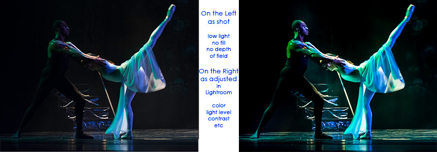
This pair of pictures shows the kind of good stage lighting which looks good both on stage and in camera. This is from the September 2017 JCCC New Dance Partners show, lit by Burke Brown. So I am now adding Burke Brown to my small list of very good lighting designers. He did a pretty piece of lighting work, clean, solid and well balanced. Note in particular, the fill light which glues the light and dark tones together. The picture on the left is straight from the camera, as shot, without any kind of adjustment. The exposure setting was ISO-3200, f/2.8, 200mm (80-200zoom), 1/100 sec.
It is good enough that I could have left it alone and most people wouldn't know any different. Still, I've made some minimal adjustments:
1 - slightly increased contrast
2 - slightly lowered highlights
to get more highlight detail in the white costume and along the tops of her legs.
3 - dodged a couple of areas in the photo, such as both heads, especially the backs of the dancer's heads to open up those tones
4 - added a bit of vignette to darken the corners, noticeable at the bottom.
Bad lighting example(s) coming here, next (still updating)
 Exposure data for above: 80-200mm zoom lens, ISO-3200, f/2.8, 1/30 sec at 200mm - This lens is at its maximum extension and shallowest area in focus. 1/30th second is at least 1/10th to 1/15th the shutter speed generally considered minimal to shoot motion.

Exposure data for above: 35mm f/2 prime lens, ISO-3200, f/2, 1/100 sec - note, the prime lens (single focal length) is used for its f/2.0 aperture, hoping for a faster shutter speed. That allows in more light but shooting wide open means that the area of focus (depth of field) is extremely shallow, measured in inches depending on distance.
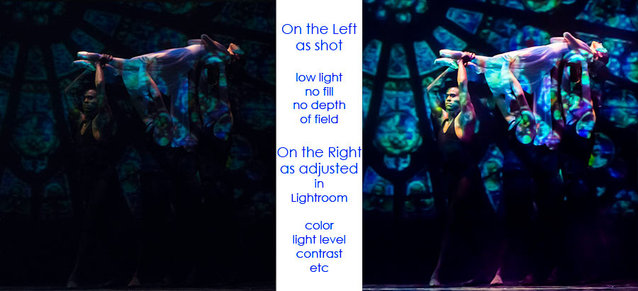
Exposure data for above: 80-200mm zoom lens, ISO-3200, f/2.8, 1/15 sec at 200 mm. Shallow depth of field and a shutter speed easily 1/30th of the desirable shutter speed for shooting motion. I should probably have increased the ISO to 6400 or higher.
While I've gotten used to working in conditions too dark for even tripod shots of people standing still this is what I have to use most of the time because the lighting is simply too dark, unlike the examples above from a show lit by Burke Brown.
Setting Light Levels Based on Camera Capabilities
This brings up the means to set levels for cameras, which also works nicely for audiences. Remember, human eyes will adjust to anything on stage, much as eyes adjust to television screens (see below), starting with the lightest areas (also below).
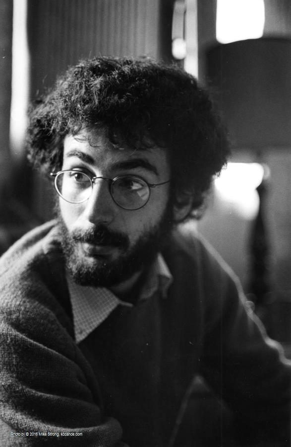
I am reminded of when I first started printing pictures. The photos were good but my technique was not yet there. I didn't know what a full-range healthy looking print really needed to look like. I kept trying a little at a time to get a better range. Until one day I just really kicked over my careful boundaries and learned to make the prints really snap. I pushed way into ridiculous territory and then pulled back until I found the sweet spots. I would have taken forever to get to those spots the way I was going.
Pet Peeves
- Comparing my technical image quality (tonal range, detail, noise) under stage lights uncontrolled by me to studio photography with full light control by the photographer with high powered strobes.
- Being expected to magically produce a dance movie from stage spacing rather than camera spacing and from a fixed position back in the house instead of in close or directly on stage.
- Having lousy video quality because there isn't enough light to make the camera look as good as it can look.
- Assuming the photographer doesn't need rehearsals or subject knowledge, just show up, point a camera and click. Both dancers and photographers make this assumption.
Everyone wants to have work they don't mind putting their name on. That includes me.
Shooting under studio conditions with a few poses is much easier technically but often seems to lack energy and clarity. Studio shots can go pretty flat if they are just poses or jumps but at least they are given to the photographer and directed by (at best) a dancer. The direction from another dancer or choreographer is why a lot of photographers shoot dancers in a studio. Someone will be checking their output all the way through. They just turn out a flood of exposures.
Production shooting during rehearsals and performances has an energy you can't usually duplicate in the studio. Because the dancers have a goal in mind and a character and a narration in mind you see an obvious clarity in performance. But it means you need to know when to shoot and if you miss something it might not get repeated until the next performance. There is no one holding your hand as you shoot. Then there is the lighting which often compromises or even sabotages your pictures when it comes to reproduction quality later.
Two Consequences of Darking
As an area gets darker both human eyes and cameras (film or digital) change how they view a scene. Although similar, their response changes in different ways. There is always a "conversation" between intent, whether you are recording a scene to look the way your human senses perceive it or whether you are recording a scene to show something you could see only with a camera. If you are looking for "truth" you might want to re-examine the concept by which you believe in a picture.
Below are two sections detailing:
1 - Human eyes which change in their perception of a scene as edited in your brain.
2 - Machine eyes (film or digital) which change in their ability to record sensory date from a scene.
#1 - Problems with darking, for human eyes (perception): 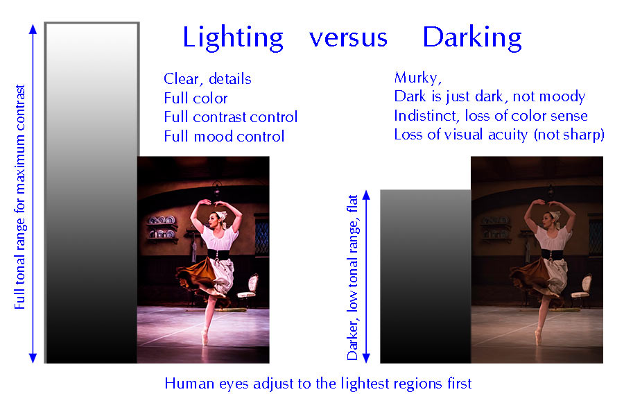
1 Not enough tonal range for good contrast
Contrast by definition is the amount of difference between the brightest area and the darkest area. If you lost that tonal range then you also lost contrast.2 Not enough light to see colors fully with our eyes, cameras differ
As light levels dim so does our ability to see colors. Cones detect color but need more light than rods. Cones lose their ability to see as things get darker. That means the rods pick up the job but the rods don’t see color, just tonal values. That means that as our eyes view the stage, color filters on lights and color in costumes becomes less visible and less colorful. Subtle colors get lost completely.But the shift from cones to rods has another consequence in diminished sharpness.
3 As it gets darker human vision loses acuity (sharpness), cameras somewhat but for different reasons
Visual acuity deteriorates because color receptors occupy the sharpest area of the eye, the fovea, a tiny area comprising only 0.6-degress of coverage in your entire visual range. The fovea is where all our detail vision shows up. The rods, the remaining receptors, don’t just limit you to grayscale, they also leave you with fuzzy imaging. That is because they are outside the area of sharpest imaging.4 Humans adjust to the lightest levels in a scene, cameras are set to a range
Without a bright enough area for the eye to adjust to the eye begins to dark adjust turning your starting “dark” into a dingy basement look. The parts of the stage you wanted to be a nice sharp black just wind up increasingly visible and junky looking. The best way to have a perceived full black is to have a very bright area elsewhere on the stage. Our eyes adjust most rapidly to the brightest areas making the other areas appear darker by comparison, regardless of how dark the areas are in foot-candles. Remember, specific light levels by measurement are fairly worthless when you realize that the audience’s eyes will adjust to the brightest levels. If you have no really bright levels then the darkest areas are not dark enough by comparison to prevent a gradual adjustment turning those black areas into slightly lighter dingy areas with limited details.USING old tube television sets to demonstrate how our brains make adjustments to what our eyes pick up.
The grey color of old television tubes is perceived as black when human eyes adjust to the brightly illuminated areas of the screen.
Remember, the television screen is unable to generate black. It generates one thing and one thing only, light. Our eyes and brains adjust for the light which generates the black.
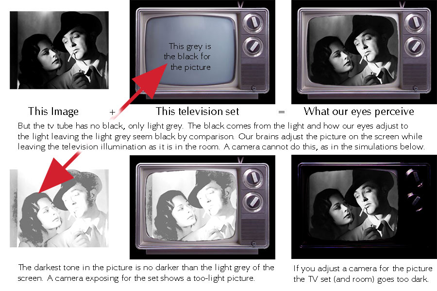
Our eyes adjust most quickly to the lightest levels of a scene in front of us, causing less-illuminated areas to appear dark, or black.
In the first decades of television, TV sets were
a box in the living room with a blank light gray rounded-rectangular
glass window of the television set. No television ever had a black screen, as they have now.
Phospor dots on the inside of the television tube lit up and glowed at
varying levels when hit with a beam of electrons from a cathode at the
back of the tube. Our eyes immediately adjusted to the lightest areas on
the screen. We saw a full range of tones from white to black even though
there was no way for the screen to generate black.
It could only generate light on a screen which was already a light gray.
The gray never disappeared which was easy to show in a photograph with an
exposure setting for the room, or with a spot meter reading the amount of
light on the screen. At no time was a tone darker than the light gray of
the screen ever generated. Instead, our eyes adjusted to a relative amount
of light. Essentially, the more light on some of the screen, the more
dark, even black, was perceived by our eyes elsewhere on the screen.
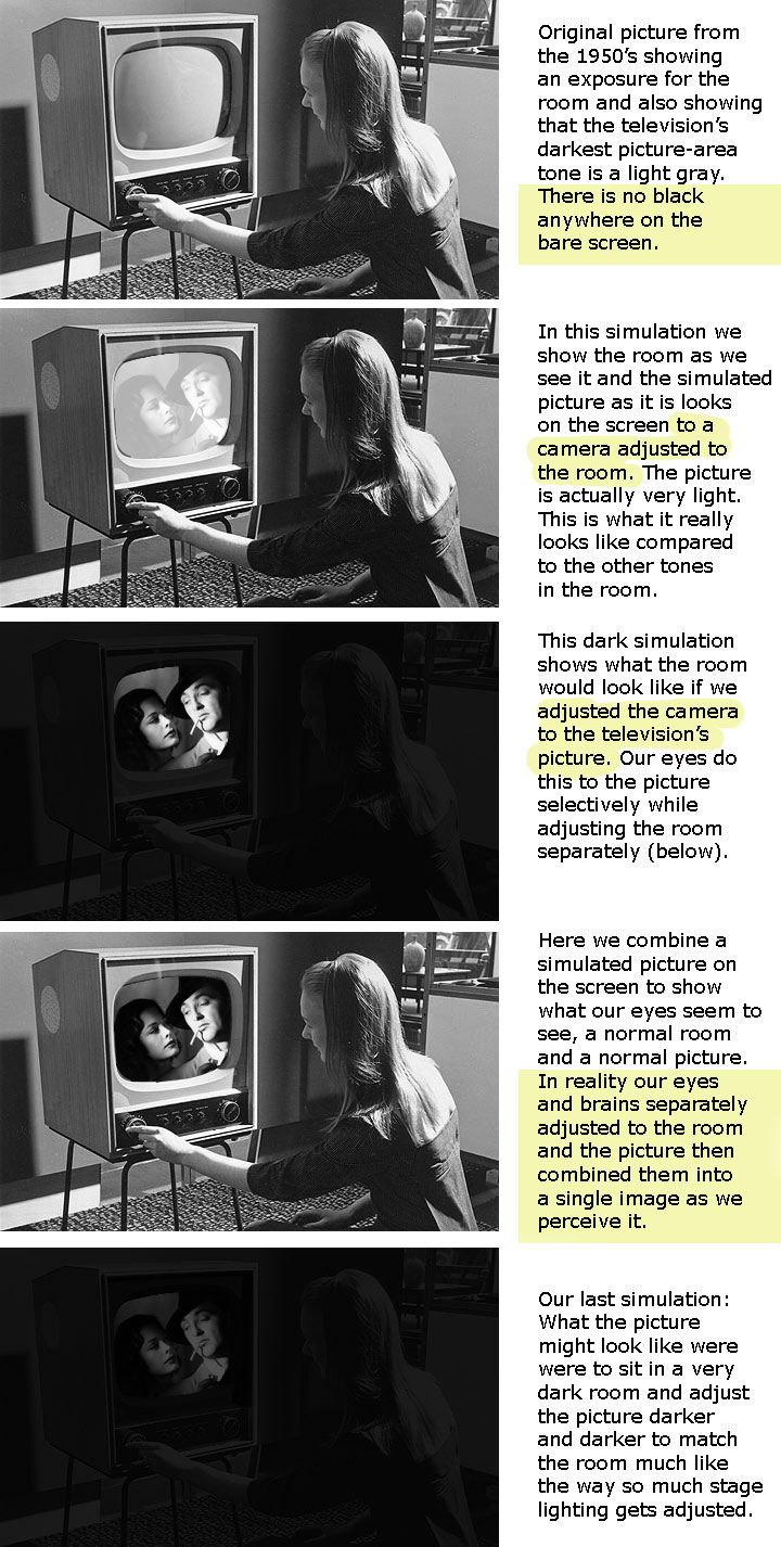
The interesting addition to this is that our eyes make the tonal
adjustment for the area of the picture on the screen, darkening the screen
until the image has a full range of tones from white to black. At the same
time our eyes (actually eyes and brain) leave the room alone, keeping it
the way it was before the set was turned on. A camera can't do this. A
camera either adjusts for the room which means the picture goes way too
light or adjusts for the picture which makes the room way too dark in the
photo.
To simulate what a human eye does you have to combine two pictures in
which one photo is exposed for the picture on the screen and the other
photo is exposed for the room light. That is what old ads for televisions
had to do in order to show a television with a picture on it rather than a
blank tube. There is another reason which has to do with scan lines but it
is a separate issue from the amount of exposure.
Here is a further example set. This time showing the room with the television set. The pictures are simulated and only the top picture is from the original 1950's shot.
6 Mood?
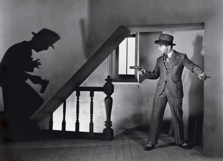
I keep asking why the darking designers go so dark. "Mood" they say. No, it is just "dark" I say. "Mood." "Dark." and so forth. I'm really not being a pest although the "lighting" designers seem to think so. Their natural enemy. They look at me with a weary eye. But just a few years ago there was more light on the stage. Every year they seem to go a tad darker. That is why I call them "darking" designers. The only mood dark gives you is "dingy" mood.
Look at the picture above with Edward G. Robinson in the title role of
"Little Caeser"
Look for film
noir on Google. There are a lot of good example from noir films and
from new photos in noir styles. Notice that they are not about darking,
they are about lighting, good lighting. No matter how much light and
shadow you can always tell what's going on and enough middle tones to
connect whites with blacks. This is not about being obscure.
#2 - Problems with darking, for cameras (recording):
Each factor which goes into any photo, f-stop, shutter speed, sensitivity to light (ISO), color of the light and so forth interacts with the others, affecting all other factors.
Digital noise (equivalent of large grain in film) affects detail
The quantity of light all by itself affects image quality. Less light means spotty coverage of pixels. That by itself breaks up the image on a micro level, mostly in the shadows.
Then, because the ISO will have to be increased to amplify what image pixels are recorded those pixels tend to aggregate and show up with added size, giving a granular effect, similar to but not the same as film grain.
This is also related a separate issue of the physical size of pixels on a digitial sensor and the directly related issue of the size of silver halide crystals in emulsion. In both cases the larger the size (pixels or crystals) the greater the chance of photons activating that location on the sensor or in the film. That is related to the smoothness of the tonal scale recorded. In a digital sensor the either amount of gain (like a volume control on amplification) or the amount of development (clumping of adjacent grains) creates a similar effect.
Slow Shutter Speed Means Motion blur: caused by subject motion and by camera motion
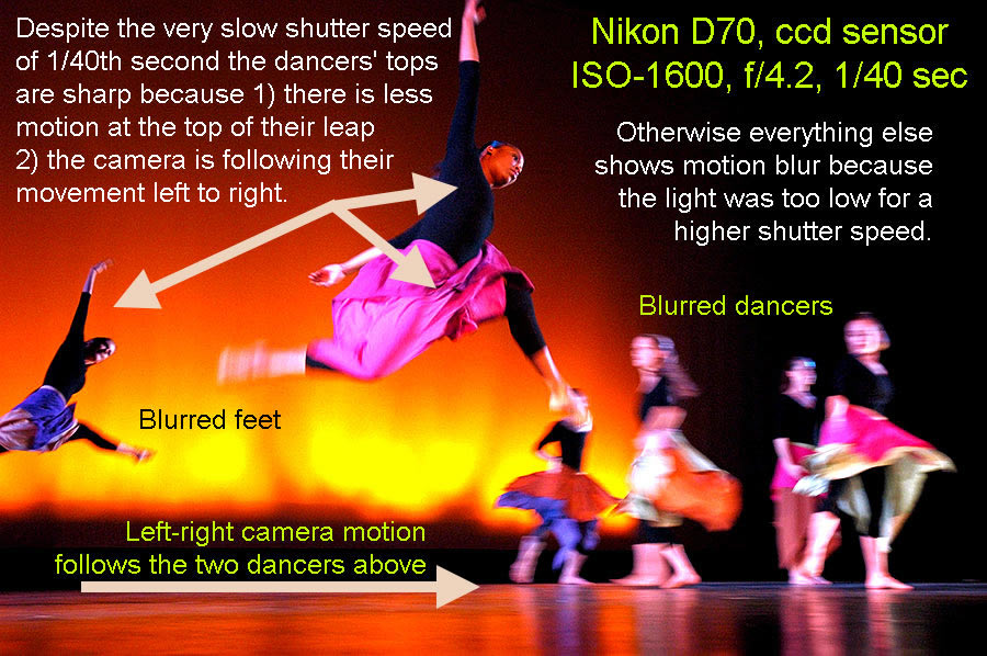
Objects, such as dancers, in motion need the highest possible shutter speed to "stop" the motion. High shutter speeds also require a lot of light. When there isn't enough light the shutter speed has to be slower to allow enough time to get a full exposure. But that means that moving objects will blur. Also, the blur is not just subject detail, it also blurs colors, dulling them.
Another result of low light is camera motion. It comes from the need to use a slow shutter speed because of low light. The slow shutter speed makes it harder to hold the camera still.
Focus blur
Low light means the lens aperture has to be a wide as possible to let in as much light as possible at any shutter speed. But the wider the aperture the shallower the focus area (called "depth of field"). That makes critical focus very vulnerable to lost focus or merely soft focus, making an otherwise good picture into an un-usable picture.

Depth of field and focus

The more the aperture is open the less the area in front of the lens which
is in focus (see depth of field above). The wider the aperture the
shallower the depth of field.
As someone who started photography well before the first autofocusing mechanisms I am most happy with manual focusing, manual everything, actually. With a good manual lens I always set the focus according to the scale on the lens and by estimating the focusing distance. It is clean, specific and very nice to work with. However, the way modern camera lenses are made, especially those made for digital cameras, manual focusing is often less clear and specific than it was for the old lenses. Indeed, some focusing mechanisms are servo driven, not direct, and will focus beyond infinity (no infinity stop). The earliest autofocus mechanisms involved ultrasonic sound (Polaroids), were very general in area of coverage and extremely slow. The latest autofocus technology can nail down a tiny area in the coverage to focus on, and do it very quickly. But never has autofocus been able to read the photographer's mind or see where her or she is looking.
Still, because of modern lens design, autofocus has to be used more than it can be avoided. It is a love/hate thing for me. I've learned how to use it quickly in dance but I am still constantly fighting two major errors: (1) when the camera won't let me take the shot because it has "decided" that I am not in focus and by the time it does let me the shot has turned into junk (2) changing the focus at the last instant to the back of the room or set instead of on the dancer because the dancers (as always) moved and the autofocus locked on something bright and contrasty in the back - rendering the dancer or dancers blurry or at least soft enough I can't use the shot. Almost all other shooting situations don't have this movement-causing-focus-loss problem because almost all other shooting situations do not have constant movement.
Constant Light Changes, amount, direction, color
Having to follow changes rather than control the light means that the camera is always behind. That causes a lot of lost shots and a lot of lost transitions in video. If you are paying the photographer to come up with pictures, your money is better spent if you help the photographer.
For still cameras: Trying to follow the lighting changes means that the camera operator is always trying to follow. When the light changes it can take several frames to catch the shift and to make adjustments to that lighting change. All of those are missed opportunities. You are paying for that.For video cameras: Light designed for cameras is set so that any light changes work within a single, optimal camera settings. Best f-stop. Best gain. However, when the camera has to follow the lighting changes there are problems. There is a certain amount of lag time between when the light changes up or down and the camera is able to reduce or boost the gain. That means either the video goes dark for a while until the camera catches up or it blows out the picture until the camera catches up. It also means the the camera operator is engaged in a forever war with the lighting, instead of working together.
As gain changes to adjust to lower levels of lights, so too does image quality. This complicates editing tremendously. In the editor segments of video clips have to be adjusted separately with a crossfade between the out-of-(camera)-range light changes.
High ISO means both high contrast and more digital noise in the image
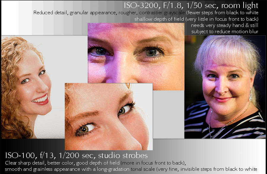
These two pictures illustrate the difference in image quality between
light from a studio strobe and light from dim lighting in a dim bar. Below
is a 100%-size comparison.
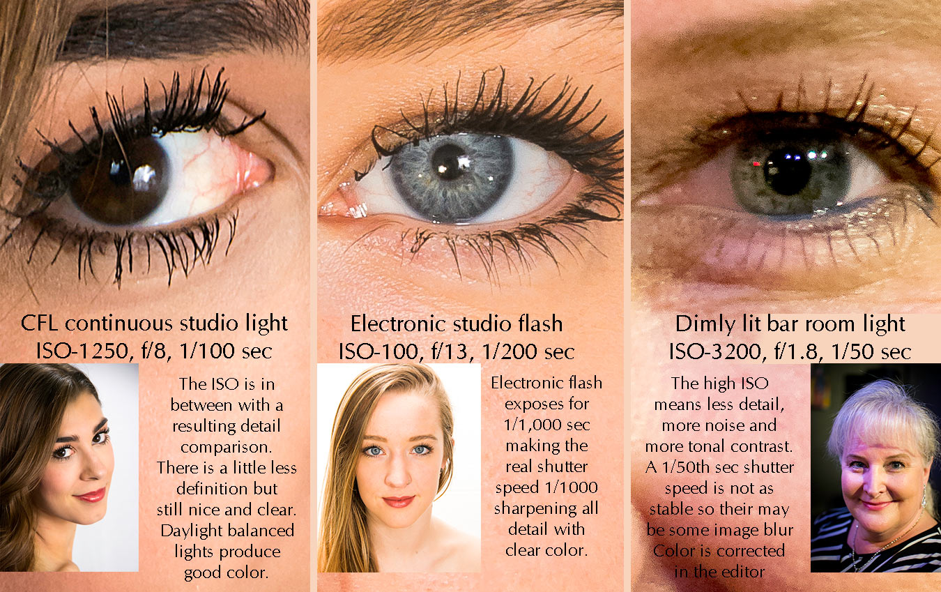
The comparison above is between three shooting situations. The two on the left have studio-type light control while the one on the right uses available light as it is,
1 -
On the left is a good spectrum from daylight studio flourescents which produce continuous light (no flash) and require a somewhat higher ISO. Details are held with focus and the highest possible shutter speeds.
2 -
In the middle is
all the light I want for a low ISO combined with a good spectrum, small aperture and
fast exposure. The shutter speed doesn't matter because the electronic flash is almost all the light in the picture and this is only "on" for 1/1000 second, essentially a shutter speed of 1/1000th second. You can see the crisp detail. The low ISO (allowed because of the large amount of light from the studio strobes) produces the full (continuous) long-scale tonal range you see as the silky-smooth skin tone.
3 -
On the right is a less controlled situation, taken in the
Uptown Arts Bar during a tap jam. Very little light was in the room so I had to use a high ISO. The light colors were a mixed spectrum meaning color corrections later which are not optimal. To shoot in these conditions I am using my
widest aperture available (f/1.8) on a prime lens (not a zoom) and slow shutter speed which means hand holding very carefully to avoid motion blur at the slow shutter speed of 1/50th second.
Here are extended comparisons:
On the left:
(CFL) continuous flourescent lighting source balanced for daylight.
This allows me to adjust the position and amount of light although the "studio" is a quick light setup in a hallway with a white background cloth.
The amount of light is less than electronic flash (below) so I need and ISO of 1250 for a good f-stop (f/8) at this close distance (4.5 feet) for a better depth of field. Even so I am using 1/100th of a second shutter speed which is not as crisp (in combinatin with the 1250 ISO) as you can see by looking between the first two images. The high ISO gives a little more contrast.
The detail is still good however, thanks to newer camera sensors, good enough that without putting the first two together you might not spot the difference.
Compare the detail in hair and skin with the second image.
In the middle:
I have control over light placement in a hallway studio type setup with a white background cloth.
Electronic flash: good spectrum with daylight color balance for best
color, a lot of light, evenly illuminated with a duration of about
1/1,000th of a second which stops any motion, subject or camera, prevent
blurring of subject detail or of colors.
F/13, a small aperture which means greater depth of field (how much is in
focus front to back on either side of the focus point) which adds to the
overall detail sharpness.
ISO-100 which gives us more detail, smoother tonal gradation, no
camera-added contrast, fuller and truer colors.
On the right:
Room light with mixed spectrum which makes color correction after harder.
f/1.8, the maximum possible aperture for this lens (widest opening) means
smallest depth of field (only inches, if that, in focus front to back from
the exact focus point)
ISO-3200 meaning amplification. Grainy-like digital noise obscuring
details, creating a higher contrast tonal scale with fewer steps making
correct exposure touchier.
1/50th second shutter speed is very slow. Too slow for most motion.
Requires very steady hand holding to keep detail but still easy to get
micro-motions slightly blurring or making less distinct small details such
as hairs, fuzzing some colors and making focus distance more critical to
hold steady.
Comparing these settings to each other
f/1.8 is about 5.5 f-stops more light per exposure time than f/13 or about 45 times as much light enters the lens for the same exposure times at f/1.8 than at f/13.
ISO-3200 is 5 stops more light per exposure time that ISO-100 (100,200,4000,800,1600,3200) or 32 times as much signal amplification at 3200 than at 3200.
The photo at far right is more typical of shooting situations on stage, especially on a dance stage than either of the two photos on the left. The kind of detail, color control and fine tonal gradation available when the light is controlled for camera is simply not the same as the normal situation shooting dance live. Yet often the technical quality of the later is compared unfavorably to the studio-controled shoot. I have to admit to grinding a few teeth on that comparison. Which is why I sometimes welcome the chance to show what the very same camera can do when it is able to shoot using its optimum image-quality settings.
If you bother to light the stage with the camera in mind you will have a similarly great result with live dance pictures and it will still look good to an audience. Like these examples below.
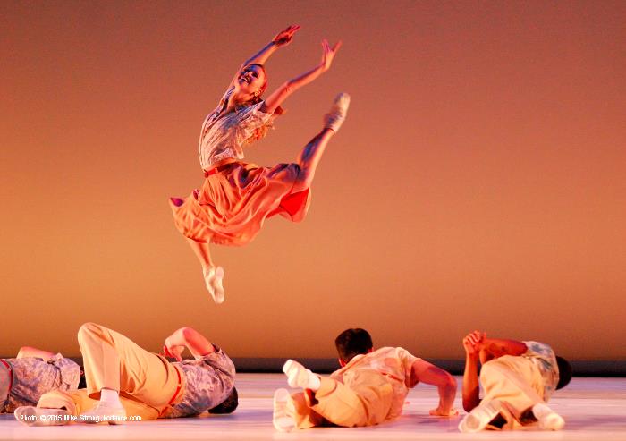
ISO-800,
ccd sensor
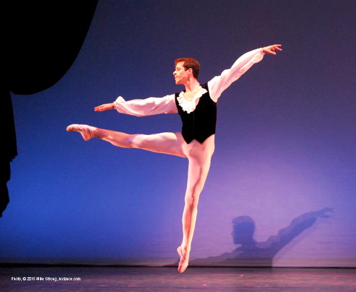
ISO-800, ccd sensor
-8604_P.jpg)
ISO-2500, cmos
sensor
In video, more considerations
Video gives some added problems. For one, the image sensor is normally much smaller than for an equivalent still camera (or sensors for 3-chip cameras). That gives better depth of field but less resolution.
Then there is compression. Other than some digital cinema cameras used in Hollywood or other big-budget areas if your camera cost less than $15 or $20-thousand you will always have a stored image which is greatly compressed in order to fit in on available storage media.
In addition most cameras up through prosumer and better usually store the image to file or tape in
4:2:0 chroma sub-sampling. This means that every fourth pixel gets
recorded.
In 4:2:2 every other pixel gets recorded.
In 4:4:4 every
pixel gets recorded. Still cameras normally sample at 4:4:4 in RGB (ie. red,
green, blue JPGs).
4:2:0 (one in every four pixels) may sound as though you are losing a lot of color information, and you are, but the eye relies more heavily on luminance (tonal changes). That means we don't notice the loss of color as much. On the other hand if you are doing something heavily dependent on color distinctions, such as green screens, then the more color directly sampled the better (4:2:2 is better for green screen work).
Regardless of the camera, the more light available for the camera to record, the better the eventual video result.
Video examples in frame captures
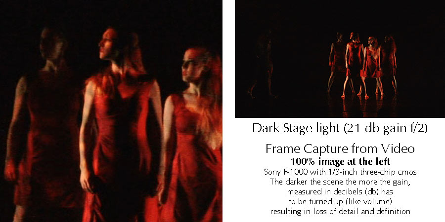
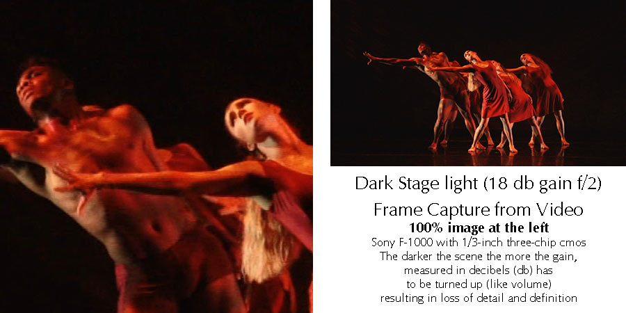
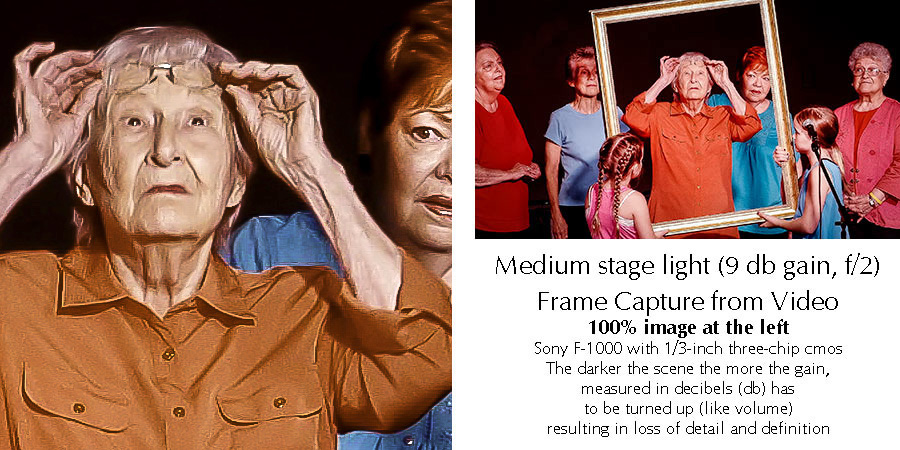
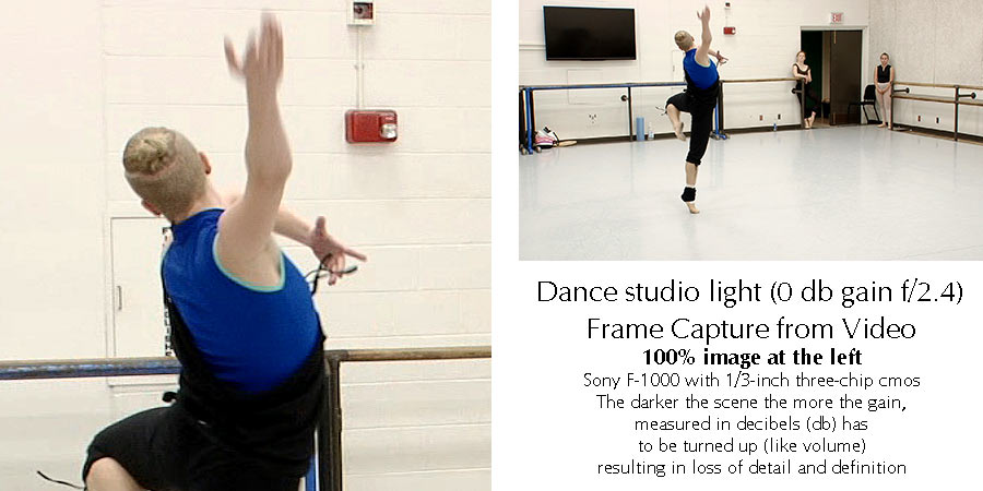
Here is a series of video frame captures starting with dark and crappy light and moving to lighter and better light. The same type of camera is used for all, a Sony FX-1000 with a 3-chip CMOS sensor arrangement. 4:2:0 sub-sampling is used by the camera. You can see that dark does you no favors. The best example, the last one, was a studio lighting setup with daylight-balanced CFLs and was designed for the camera shooting an interview television show, Dance On.
On the left side an extracted detail from the image is shown 1:1 on the page.
On the right side is shown the full frame, reduced to fit the space with exposure information in text beneath the full mage..
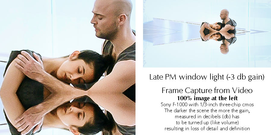
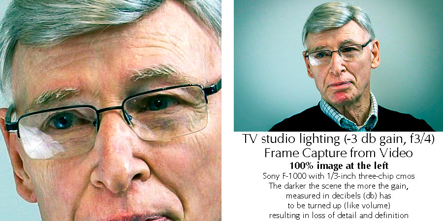
Video Example Comparison of Light Levels and Decibels of Gain
In the illustration below you can see two light-level situations for the same video camera at different parts of a dance production of "Our Town" choreographed by Philip Jerry and staged by Paula Weber.
ON THE LEFT
The camera has the best light in the show, though it is still less than I would like. All shooting was done with a wide open aperture of 2.0. I would have like 5.6 or 8 which would have meant more area in focus. Nonetheless I was able to shoot this without needing to boost the gain (a unit measured in decibels). As such the image is enlargeable and has subject detail as well as tonal gradation (shading). What's more the black background is a solid black.
ON THE RIGHT
The camera has the worst light in the show. Unfortunately this darkness made up the majority of the concert across most pieces. In order to get a visible image I had to boost the gain to 15, 18 and 21 decibels. 21 decibels is the maximum gain available on this camera. But just because I can get a visible image doesn't mean I can get a good image. It merely means I've been able to amplify the signal data from the RGB sensors.
On the right side you will see the lack of subject detail. That is a combination of two factors: 1) lack of light and 2) digital noise made prominent. The lack of light just means there are not enough photons hitting the sensors to fill out the image. Digital noise obsures and interferes with detail because it is amplified along with the small quantity of image data. The ratio of signal (image data) to digital noise (essentially static) is called the signal to noise ratio. The digital noise is always there but when you have a lot of light the illumination overwhelms the noise to the point you don't see it. However, when you have minimal signal data (image data) the amount of amplification you need (db gain) to see an image also amplifies the noise, which is, by comparison, now very noticeable.
Even the maximum black level is affected. When you have plenty of light that black background looks solid. That is because the tiny level of always-present noise is too small to notice. But when you are applying the maximum amplification (such as dialing in a 21 decibel gain) the noise, which is really just random static, gets amplified enough that it gives a weak, thin-looking black background which is now a bit mottled.
THE EXAMPLE IMAGE

Colors
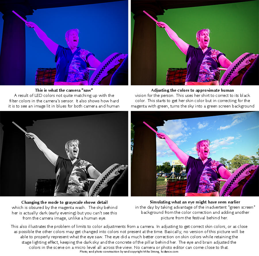
Remember, cameras only sample some of the colors in the scene leaving your brain to fill in the rest.Mis-match between LEDs and camera filters
Unlike human vision, color sensors and color film “see” color and tone pretty much equally at all levels of illumination. This is why photos taken on a dark day often show surprising color.
Mis-match between human vision (perception) and camera results
Special problems with LED lighting instruments versus camera sensor filters
LED stage lights combine red, green and blue LEDs to produce a white
light. However, unlike sunlight or even tungsten light the overall
spectrum is not continuous. It has sharp peaks in the red, blue and green
areas. Which means that a sunlight balance from LEDs is really a sampling
of frequencies which our eyes turn into a spectrum that we generally
experience as looking like sunlight. However, it is really a sampled
spectrum.
In a camera, whether film or digital, the filters used to isolate either
an emulsion layer (film) or a pixel (digital) are narrow range and provide
a sampled spectrum. When we look at a color photo we are really looking at
a sampled version of what the actual scene looked like. Our eyes put it
together so that the picture looks natural.
The spectrum differences between LED outputs and filter colors mean that
LEDs don’t exactly match the filters in digital sensors. While this is
generally not serious, the result can look like the picture below, missing
some of the colors in a way which cannot be made up by a simple color
adjustment because the colors being filtered for were not exactly
available from the LEDs.
LED Pulsing
The early implemtations of LED stage lighting failed to take into account video needs. They turned on and off with each cycle of 60hz current. At frame rates of 30 fps this tended to show a rolling flicker when recorded, although this wasn't always seen in viewfinders. If you are shooting under older LEDs this may still manifest and there is nothing much you can do about it.
Scanning and compositing a scene as done by our eyes
Once more: Our cameras are not eyes and our eyes are not cameras.
1 - A camera is a recording device
2 - A brain is a perceiving device
Our eyes do more than a camera can and far more in real time, all the time, than cameras, adjustments, Photoshop and Lightroom can do. Once again, although cameras and eyes have similarities they have very different operations. The similarities lead to the impression that anything we can see with our eyes is seen the same way by any camera. So, here is one more example of how our eyes process a scene differently from a camera. It is also a clue to how we need to adjust a picture in Photoshop, Lightroom or other photo editors.
This is also the way a painter paints a scene, unless they are painting from a photograph. When painting from a live scene a painter tends to create the image their eyes see. We need to edit a photograph with the same type of vision as a painter. It also means that if we are lighting for camera we are lighting a scene so it can be recorded by the camera in much the way we see it in person.
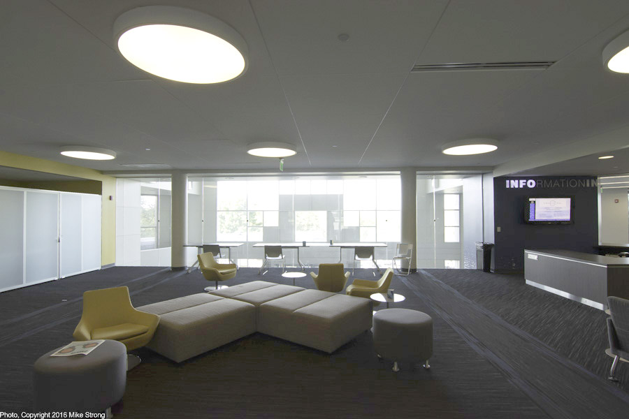
The UN-Adjusted camera image
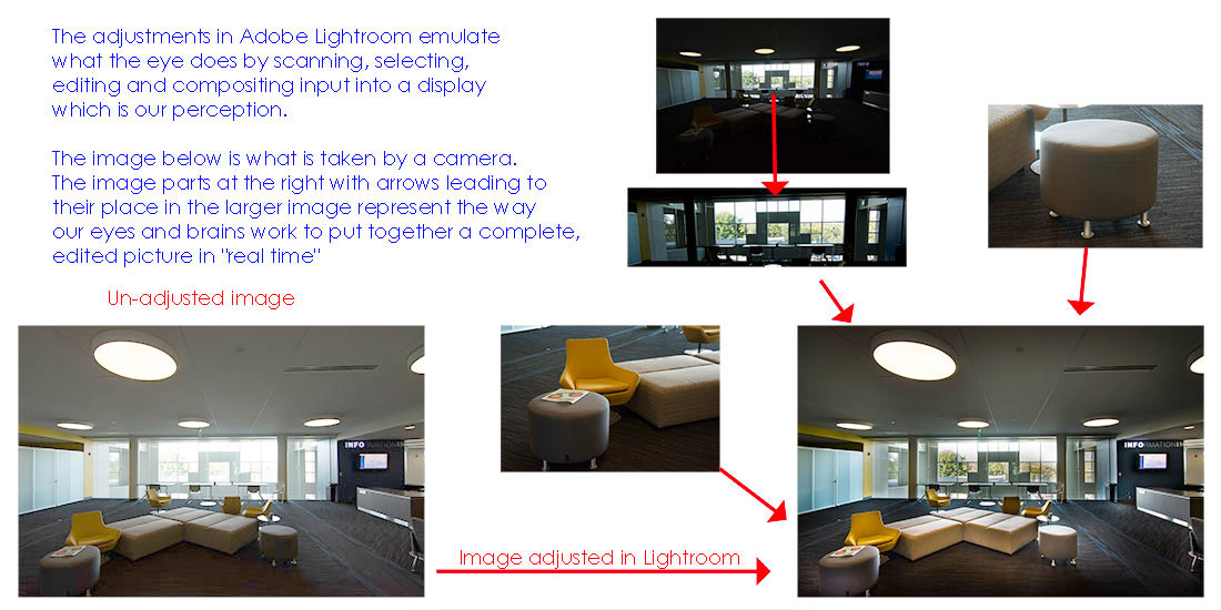
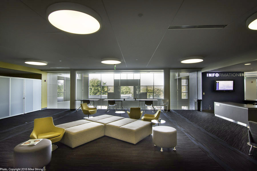
This photograph is the adjusted version as worked out in Adobe Lightroom.
A great deal has been done to produce this from the un-adjusted image above.
The window area has been "burned" and color adjusted toward daylight while the highlights have been reduced.
The furniture objects in the front have been adjusted for lighter tones by bringing up shadow details.
Overall the image has been set for daylight color balance (for the windows), contrast increased and also saturation.
Your eyes do this and far better in an instant, in every instant, and we don't even notice the process taking place.
See how master artists saw their world and what they choose to show: Not only do they paint the tone-corrected and color-corrected shades but they also paint everything with sharp lines, that is, in focus. Unlike a photograph which has a "depth of field" (a distance in front of the camera, on either side of the prime point of focus) which is in focus while areas which are too close or too far are blurred. Which is also often how you can tell whether a painter is working from life or from a photograph.
One of the touted "features" of the cinema look for video is a shallower depth of field which is a result of the larger sensor size. However, this was not originally a feature but a technical detail which had to be dealt with as a result of film with very low ISOs by today's standards. In "Citizen Kane" there is a warehouse scene which is remembered for its enormous depth of field. Everything was in focus, front to back. It was remembered because at the time it was quite a trick, an award-winning accomplishment.
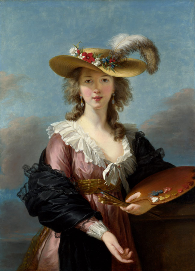
Self portrait in a straw Hat, after 1782, Louise Élisabeth Vigée Le Brun (1755–1842)
Look at the beautiful demi-tones, the delicate colors and the fill light especially in the shadow side of her face in the underside of her hat's brim and underside of the feather. The sheen on her fabric as well as the fabric details. She has also lightened the area just around her eyes. All of these are things you might do in Lightroom with RAW files. She could sometimes turn out two or three portraits in a day.
Had cameras been around in 1782 and had they taken this shot you can bet that withought using reflective lighting panels for fill light that her face would have been obscured with too much contrast rendering the shadow areas too dark to see clearly, as here. Fill light was around long before lights for cameras.
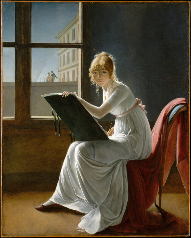
Self Portrait by Marie Villers, 1801.
In Viller's self portrait note the massive tonal scale between the sky outside and the shadow area on this side of her chair with the cloth drapings. All of them have detail which is easy to see including tonal difference of the sky area between the broken pane and the open area..
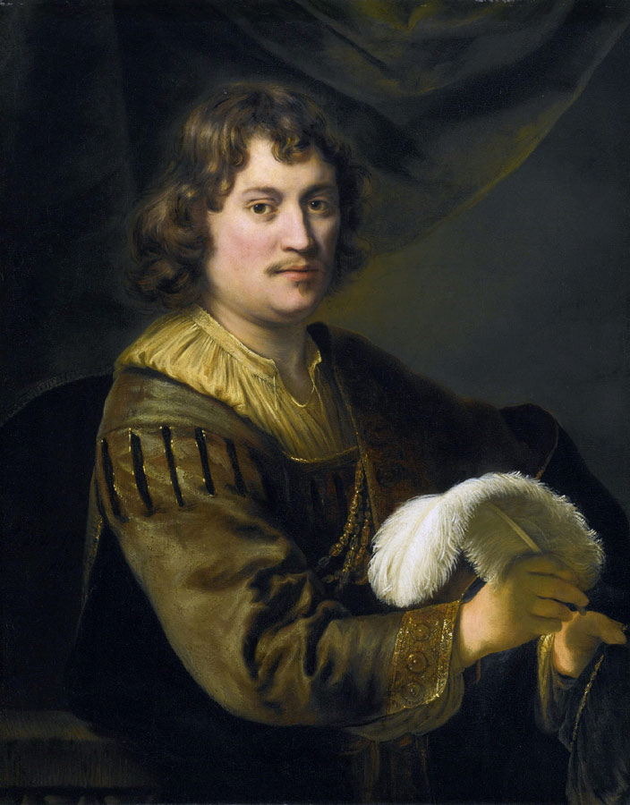
Portrait of a man holding a white feather by Marie Villers.
Note the shadow illumination on the underside of the feather and the shadow side of his hands. This is exactly the kind of tonal lift you would do working in Lightroom with RAW files.
One more example of how eyes work a scene versus how a camera works a scene. And our eyes are constantly updating the information as well as constantly and instantly processing the information in real time. A similar view from a photoeditor can take from minutes to hours to days, depending.
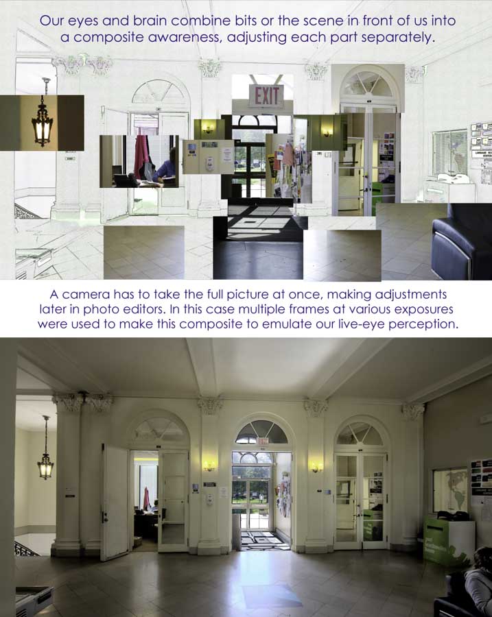
I took this shot of the lobby in Scofield hall to illustrate the point because there is a wide range of tones at midday.

The composite above was put together from this set of full exposures. You can see that a camera cannot adjust each part of a picture separately the way our eyes can.